Design approach for one service
Citizens Advice is the national advice service, providing free, impartial advice to everyone.
The Citizens Advice service started in 1939 and is a network of independent charities providing free expert advice to help the public solve personal problems.
This broadly covers the ‘alpha’ work for Citizens Advice. An alpha is the first stage of developing a new digital service.
The alpha focused on Employment and Support Allowance (ESA) because it was the biggest issue that Citizens Advice dealt with at the time. It’s the most complex benefit, and accounted for 20% of all face-to-face benefit sessions.
The digital transformation consisted of what was termed as an ‘Alpha’, it was a collection of concepts, interactive elements and ideas with a focus on solving a particular problem. The ideas were based on evidence and insights focused around a single area (Employment Support Allowance) before expanding the research and scope to other connected parts of service delivery.
Over
local Citizens Advice centres
Over
people helped in 2016-17
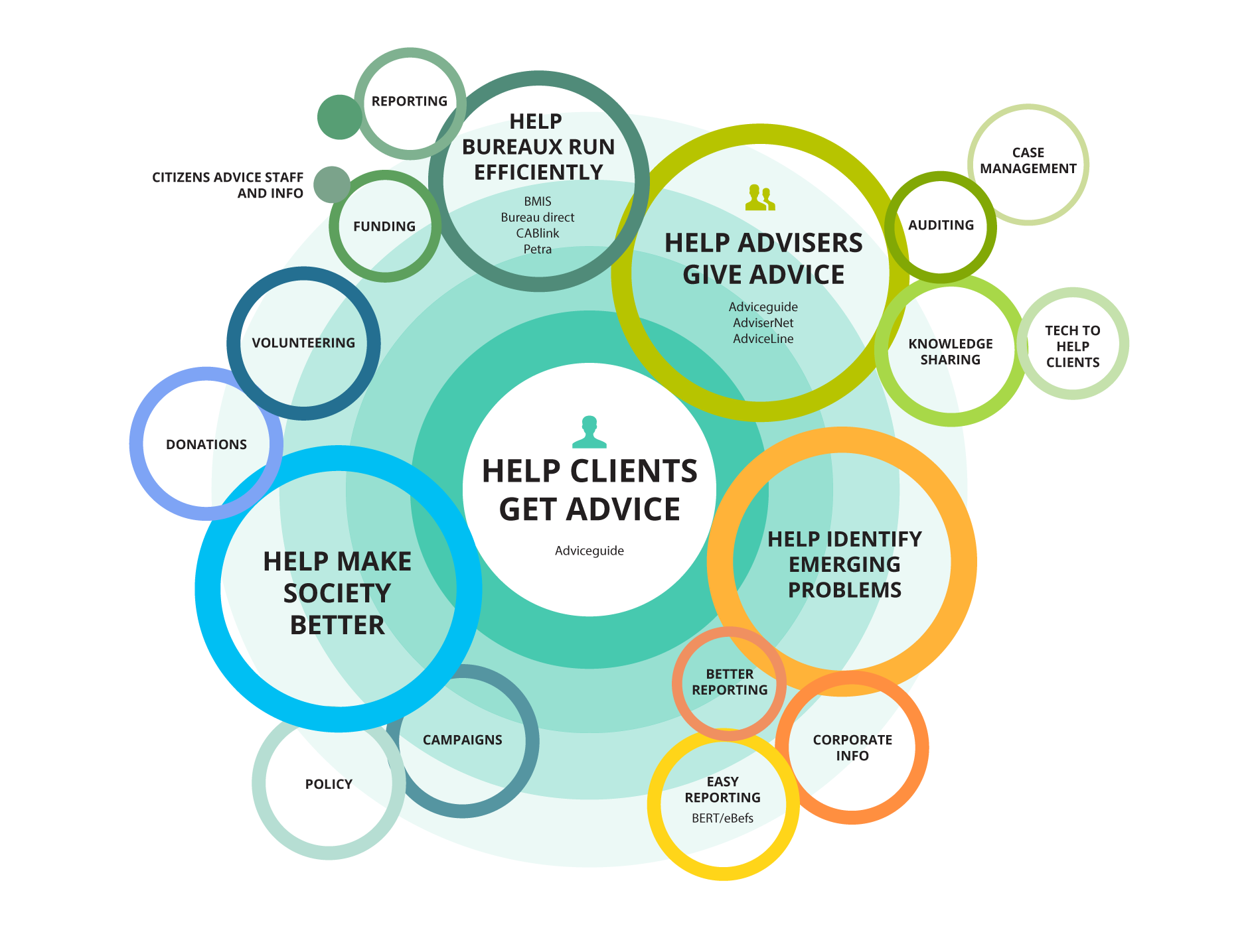
After interviewing lots of parts of the organisation we created this diagram. It helped us to break from the roles defined in the organisation and reflect on the goals of the organisation.
"organizations which design systems ... are constrained to produce designs which are copies of the communication structures of these organizations."
— M. Conway
Design approach for one service
Before looking at the visual and interaction design I worked with the content designers to research the tone of voice, using three styles, direct (just the facts), supportive (guiding and supporting users) and something inbetween. The difference between each of these styles varied between 600 and 4,000 words, with 43% of ESA benefit claimants suffering learning, behavioural or mental health difficulties, getting this right for our audience was crucial.
Once we had a style of content that we were confident in we took out the various designs out for research, taking our learnings about the optimum line-length, typography style and content structure to design the rest of the alpha with.
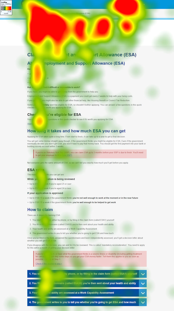
To test the design and content we also used eye tracking software to measure the reading pattern, gaze area and focus of participants. The patterns reflected a good mix of 'F' shaped patterns (scanning) and focus on important areas of information.
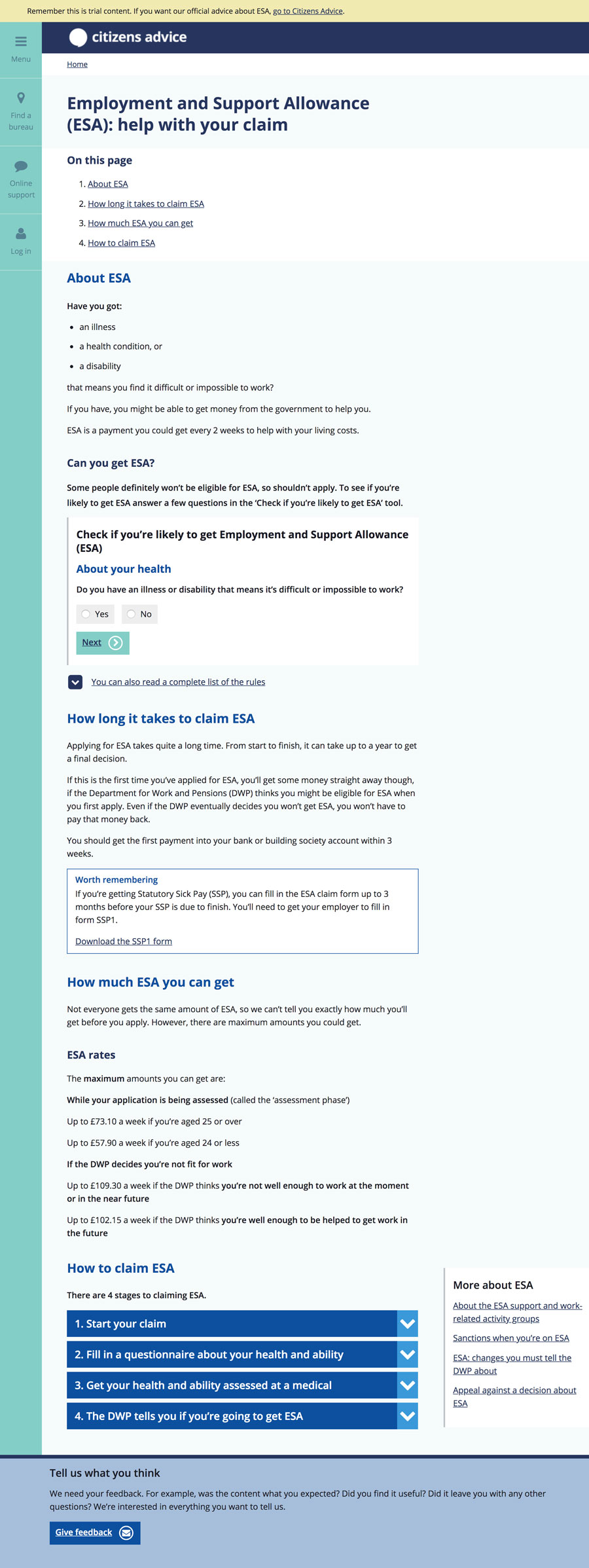
We extensively research the design and content, iterating the design to include, in-page tools to reduce content and allow users to find out whether they could be eligible before reading more about the application process.
Content design for ESA
Applying for ESA is done through a paper application. This is a huge barrier to those with motor, vision and cognitive impairments. We designed and built a proof of concept that allowed users to complete the application online, mapping content to the form in a pdf, once completed.
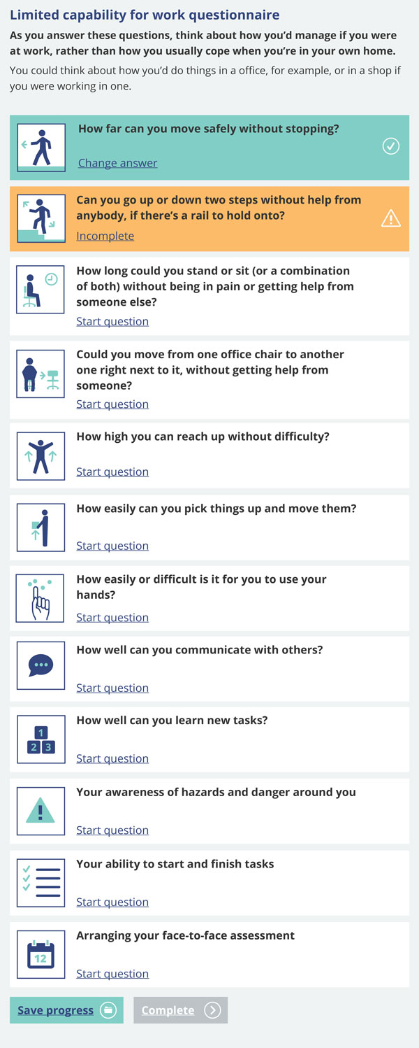
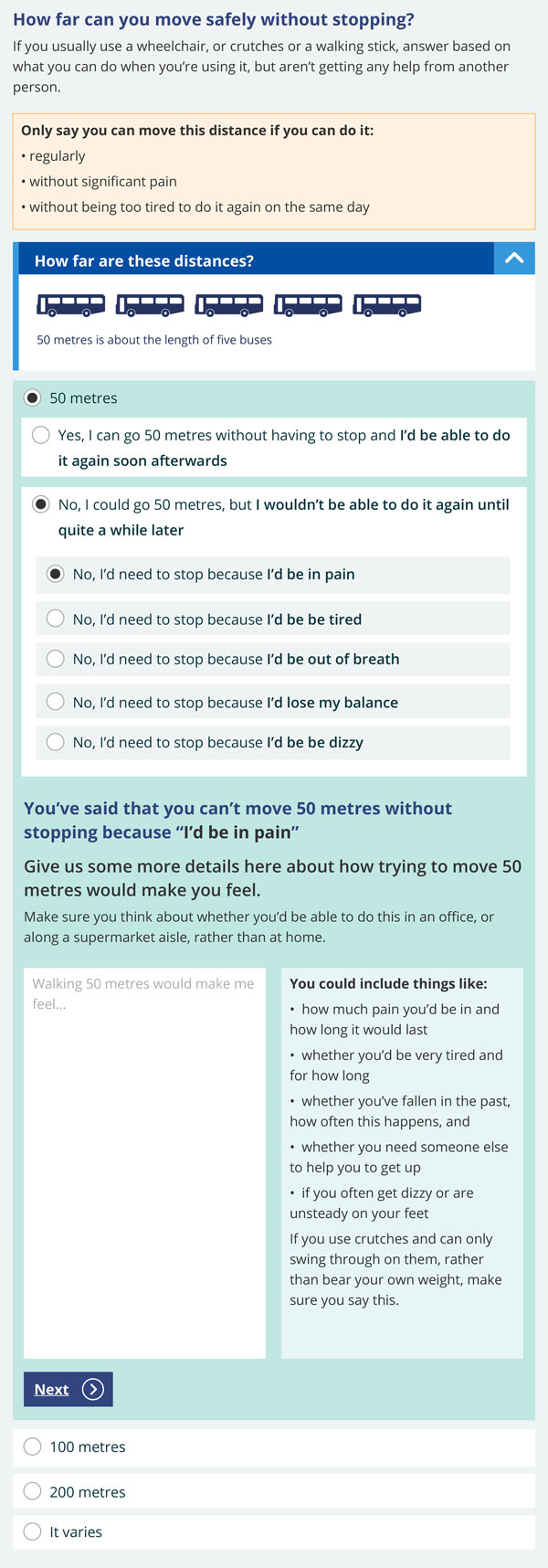
We also took this opportunity to see how the form could be improved to benefit all users. Using progressive disclosure to support and guide users to give more detailed information in their answers. We added images to clarify things that users had struggled to understand, such as distances.
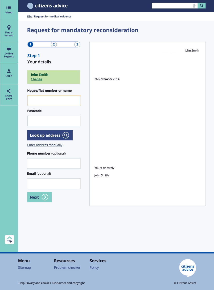
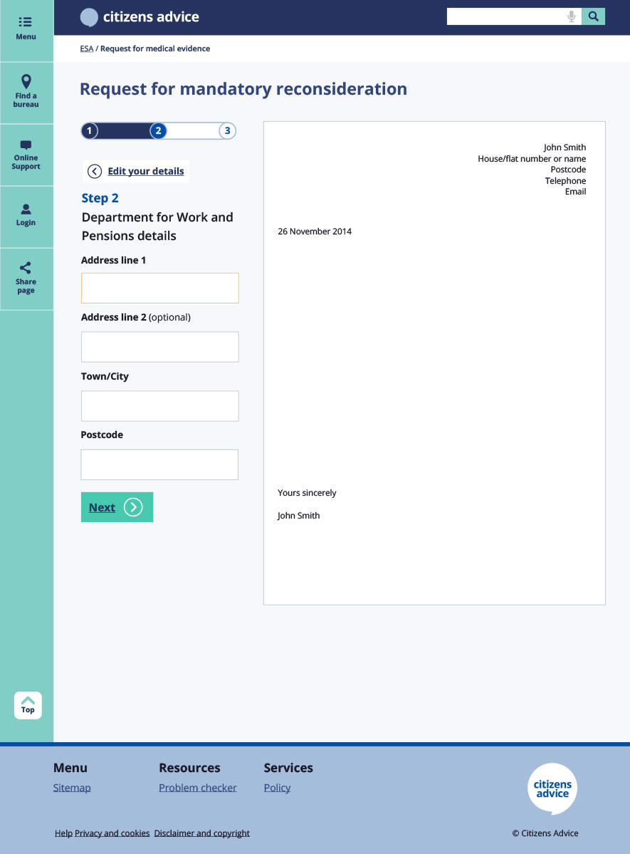
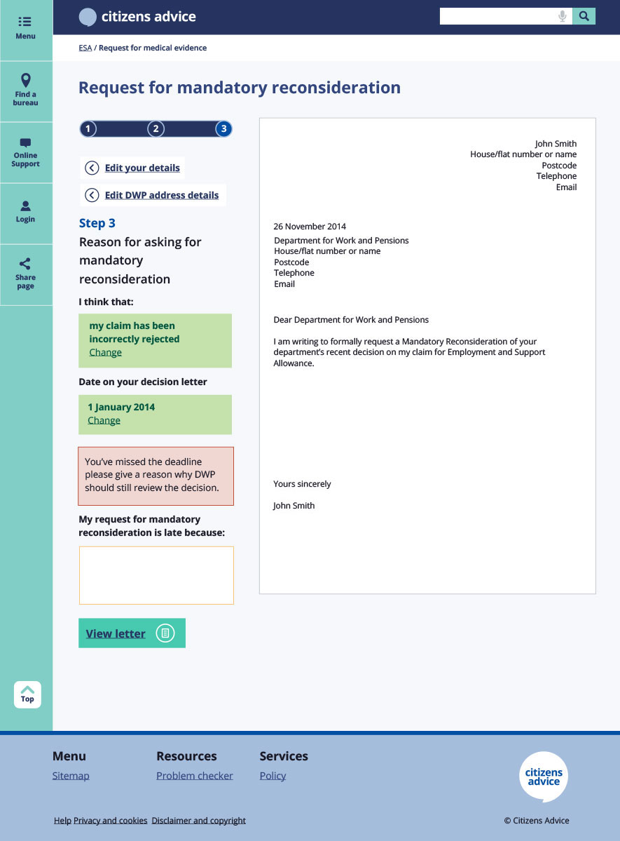
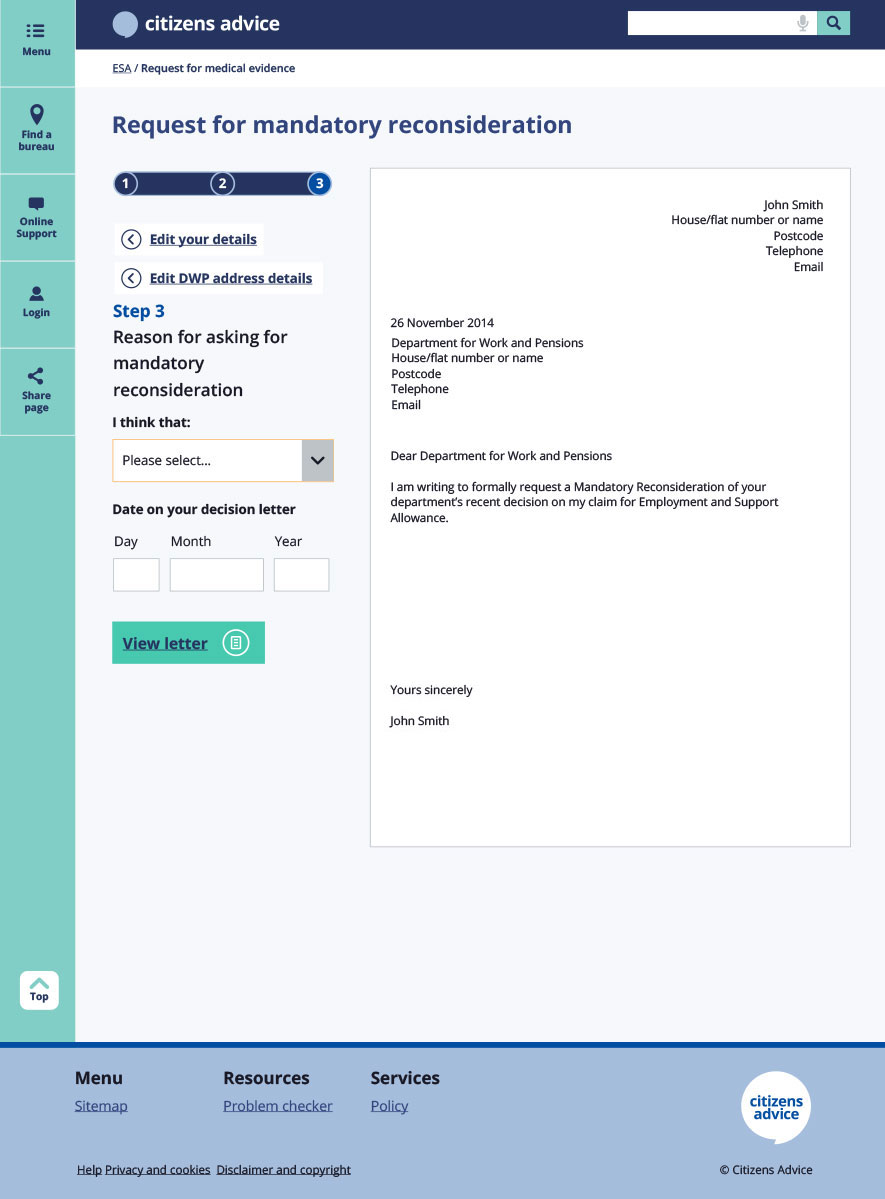
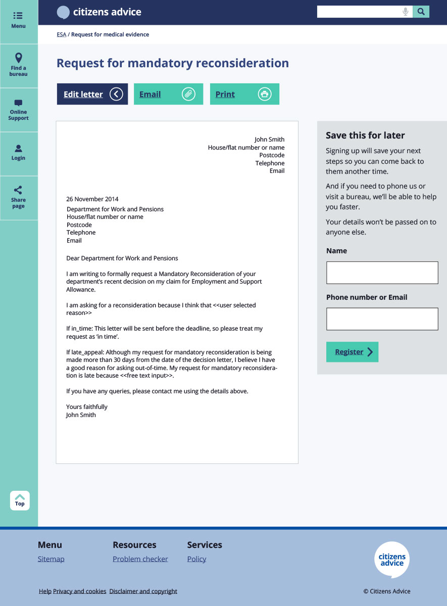
As well as the in page tools that helped users decide if and when to apply, the application form 'front end' prototype, we also created tools such as the 'template letter builder' to help users complete tasks such as requesting the information required for ESA from their GP.
The team working on this included: Bea Karol Burks, Sarah Richards, Chris McCarthy, Louise Stone, Phil Gyford and Jo Hamilton-Watson.