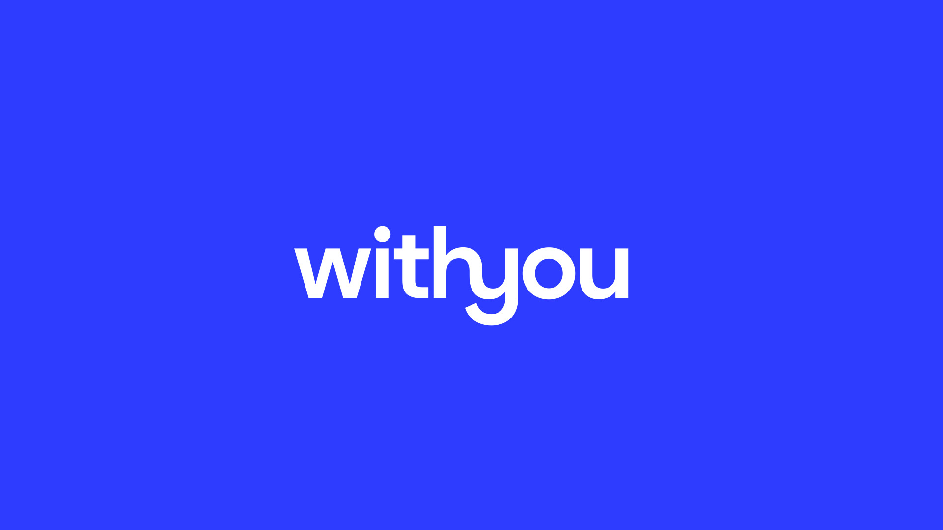
Logo wordmark
The charity supports people to make positive behavioural changes, most notably with alcohol, drug misuse and mental health.
With You (formerly known as Addaction) was founded in 1967 as the ‘Association of Parents of Addicts’. It was set up to support the families of people affected by addiction but also those who had had the doors closed on them by their friends, family and society.
The charity had been prominent in pushing for policy change and the name had reflected that but it wasn’t reflective of the service and for service users felt stigmatising and didn’t reflect the supportive, compassionate and human experience they’d received. For people not accessing help the name was off-putting and for clients accessing mental health support, it didn’t reflect the support they needed.
Over
service users
Includes
staff at 80 locations
From hundreds of names we considered, we created a shortlist to take forward for testing. We conducted numerous rounds of research with all age, gender, socio-economic backgrounds and issues.
One name proved most effective for the categories we wanted the brand to be known for and that represented the values of the charity.
| Addaction | WithYou | |
| Warm | 8 | 35 |
| Reassuring | 13 | 37 |
| Human | 10 | 30 |
| Approachable | 15 | 37 |
| Non-judgemental | 15 | 24 |
| Supportive | 23 | 43 |
| Personalised | 6 | 20 |
Logo wordmark
Logo wordmark alternative
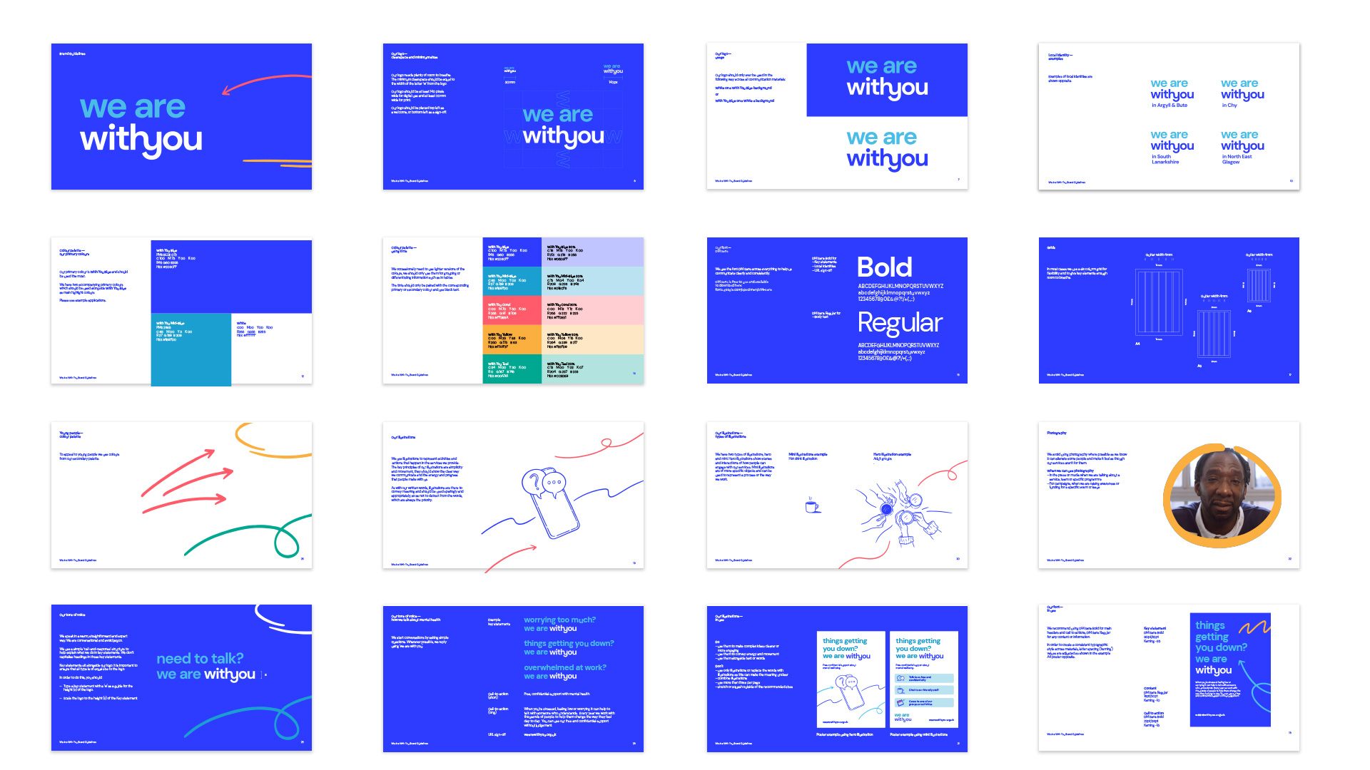
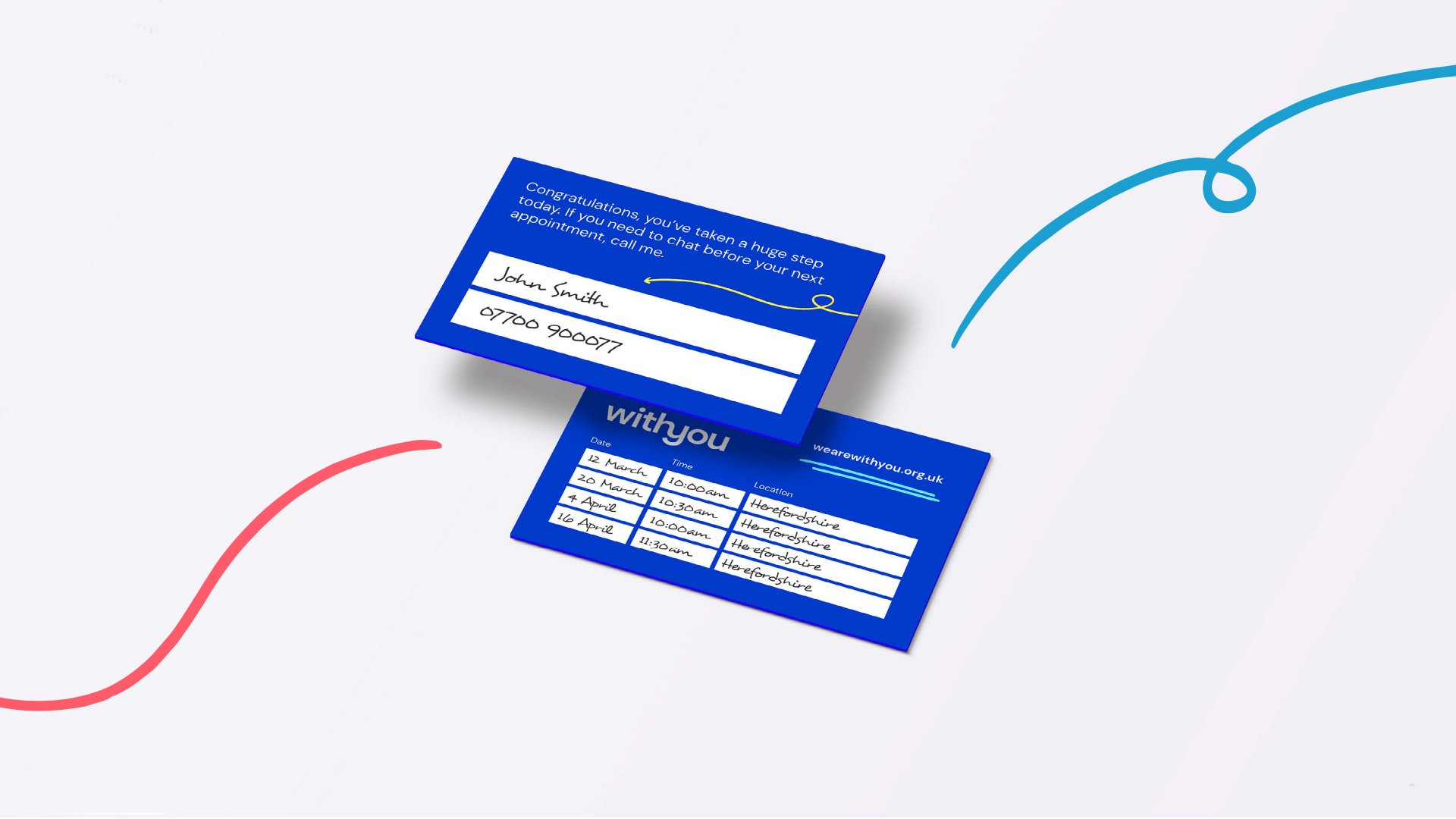
Having a solid foundation for the new brand identity was important but as part of a huge transformation it was important the brand was flexible and adaptive to make it as easy to use but as inclusive as possible.
Logo and slogan
Logo flex
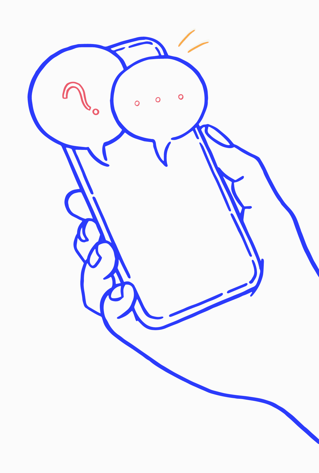
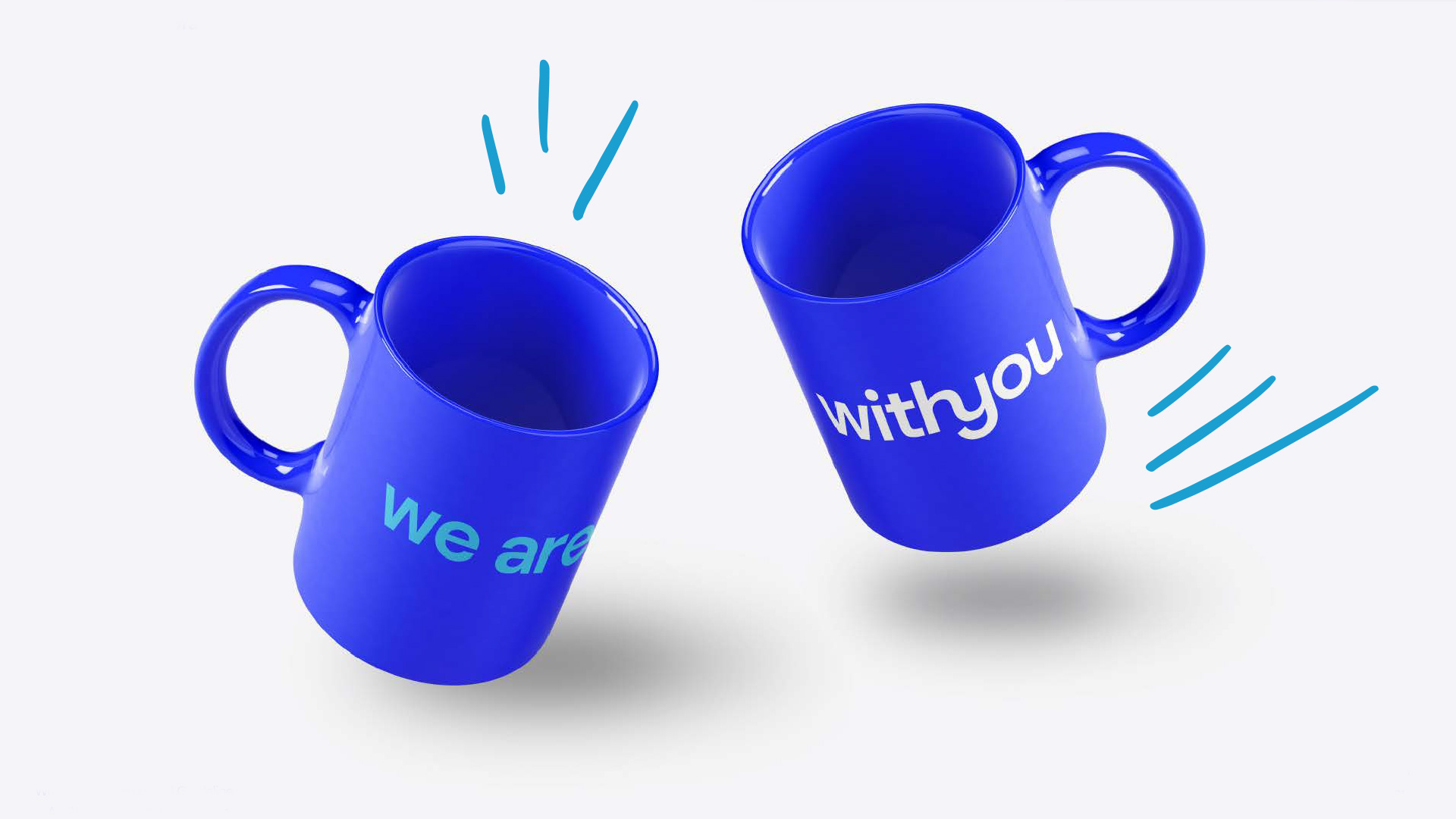
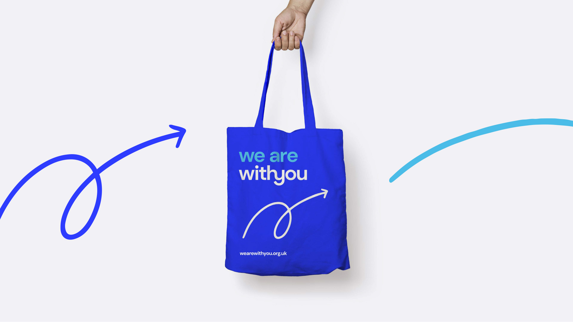
The hand drawn elements were one of the things that people loved from our research, it made the brand feel approachable and human.
We took these illustrations forward and added them to the core brand, the gestures showed movement but where possible we added movement, such as video campaigns and instagram stories.
One of the principles of the new brand was movement. We help people move forward with their lives, so showing progress and energy were key.
Animation for webchat campaign
Animated illustrations
Design guidelines
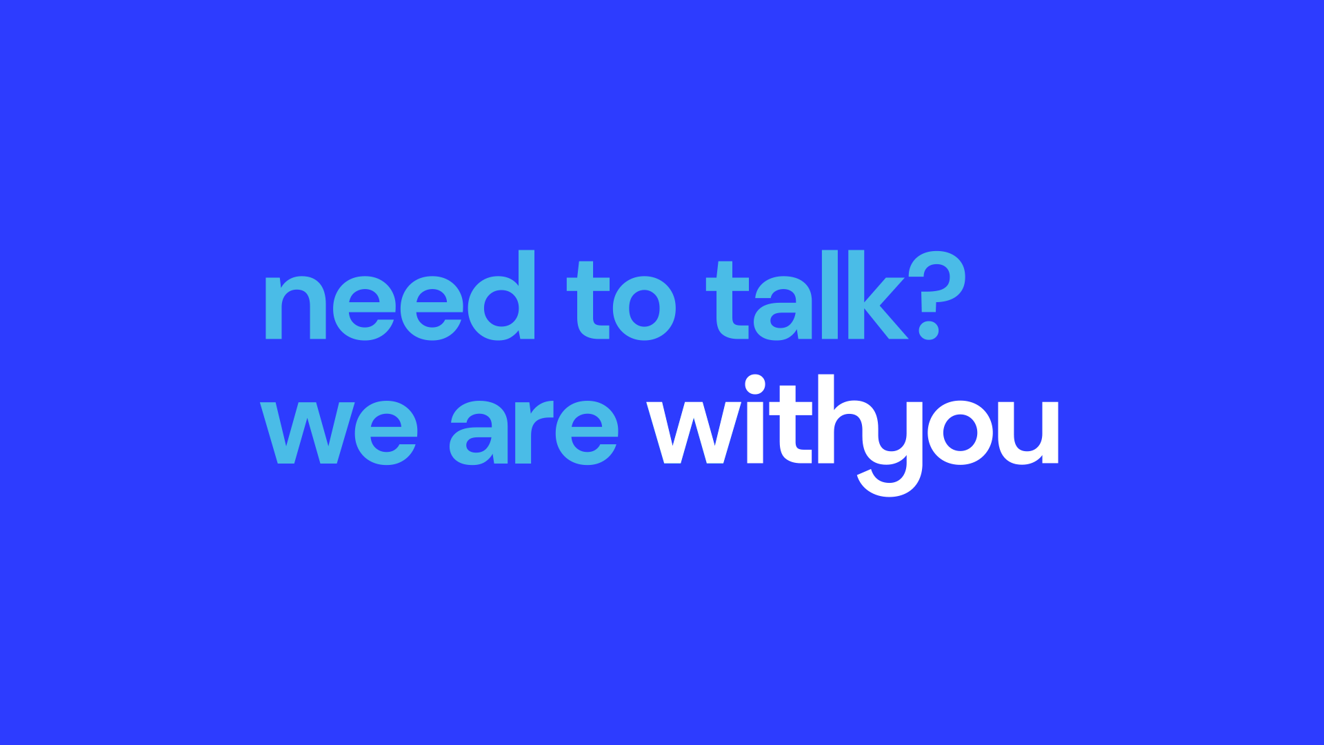
Relaxed conversations are fundamental to the service
The brand redesign was instigated from the needs of our staff and clients and by including them as part of the design process meant we could be confident it was going to work for everyone.
Seeking help for drugs, alcohol or mental health can be stigmatising and scary so it was also key that it would work for the widest demographic of people and issues who weren’t accessing help.
A supportive tone of voice
Having a brand which didn't feel stigmatising
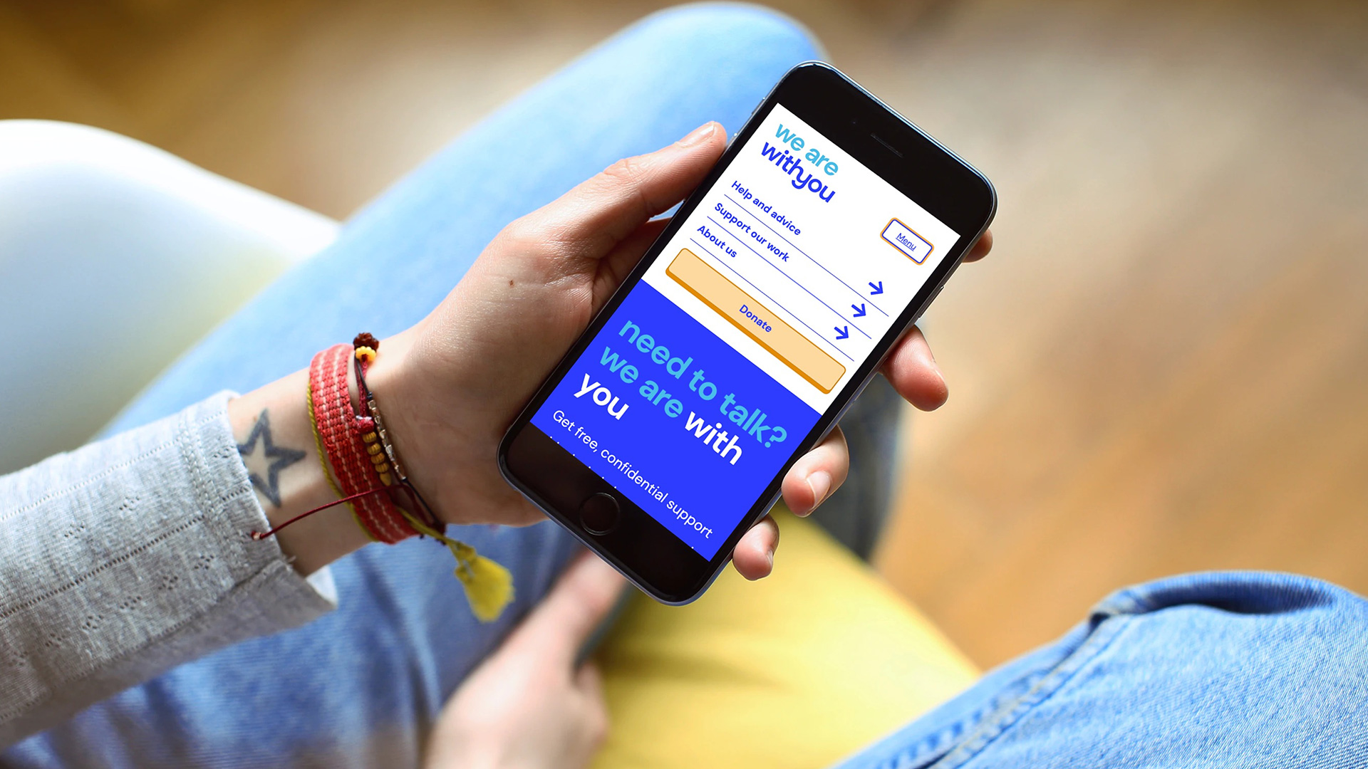
During this we also developed a new, user-centred and accessible website (case study coming soon) giving advice and online support and a launch campaign promotional video from our staff, volunteers and service users to talk about the new brand.
The new accessible, user-centred website
The team included: Emma Wilson, Eben Foster and Touch Agency